My Role
As the sole UX and visual designer on this project, I collaborated closely with a web developer to enhance the user experience and aesthetic of CreatePT's learning hub and Marketing site.
Overview
CreatePT are a fitness education provider delivering online courses to their users. They wanted to improve usability and general look and feel of the learning hub and marketing site.
Timeline
March 2024 - April 2024
BRIEF
Increase user satisfaction
CreatePT wanted to transform their learning hub into a user-centric and visually cohesive space that aligns with their marketing site. The primary goals were to streamline navigation, simplify access to course materials, and refresh the overall aesthetic to ensure consistency and user satisfaction.
Marketing site - CreatePT wanted to improve the conversions on their site, which includes purchases of their training programmes and direct contact from customers via whatsapp/contact forms.
DESIGN
I worked with the website manager to pull user behavior data using tools like Google Analytics and heatmaps to identify navigation bottlenecks and frequently abandoned paths.
It was evident that the main issues with the old design were navigation complexity and overwhelming interfaces. The Learning hub also had a lack of visual cohesion with the marketing site.

New design
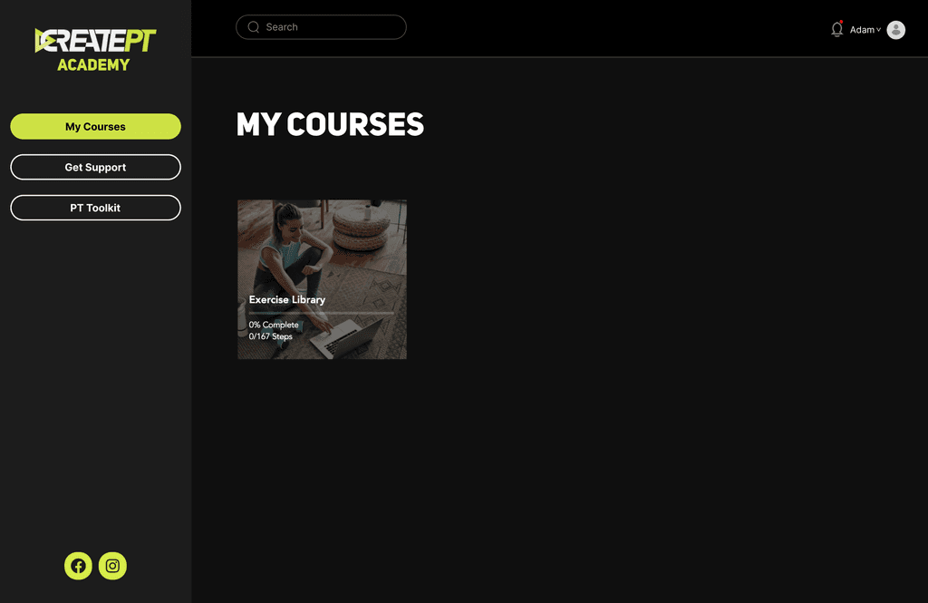
I redesigned the initial landing page to immediately display the user's current course modules. This adjustment reduces the number of steps required for users to reach their main content, thereby optimising the user journey and improving task efficiency.
Sticky menu
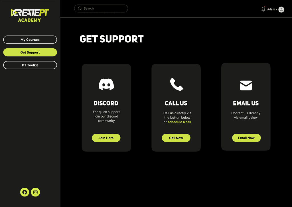
I introduced a sticky side menu to facilitate easier navigation. This change enables users to access various sections of the learning hub without having to scroll back to the top, enhancing usability and efficiency.
Minimised cognitive load
I simplified and decluttered the interface to present information more clearly. This approach minimises cognitive load, making it easier for users to focus on their learning tasks without feeling overwhelmed by excessive information.
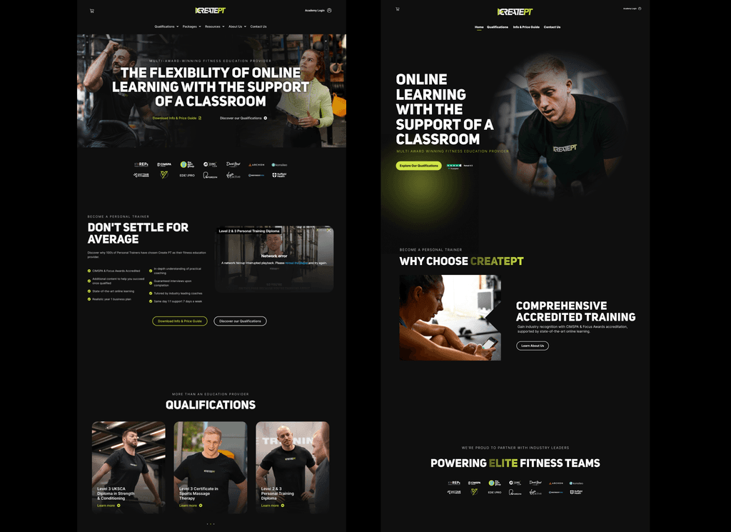
Marketing site redesign
I simplified and decluttered the interface to present information more clearly. This approach minimises cognitive load, making it easier for users to focus on their learning tasks without feeling overwhelmed by excessive information.
On the left you can see the design before and on the right you can see the new design.
RESULTS
User-Friendly and Visually Cohesive
The redesigned learning hub and marketing site now provides a seamless, user-focused experience. Key improvements include:
540% increase in conversions on the site - these include purchases, contact forms completed, instant messages and phone calls.
Enhanced Usability: The sticky menu and streamlined navigation significantly reduced the time and effort required for users to access course materials.
Improved Visual Cohesion: The dark mode and design consistency created a unified look across the learning hub and the marketing site.
TAKEAWAYS
Insights and Lessons Learned
User-Centric Design Matters: Focusing on the user's needs and simplifying their journey is crucial for creating effective digital products.
Consistency is Key: Maintaining visual and functional consistency across platforms enhances the overall user experience.
Continuous Improvement: Ongoing testing and iteration are essential to refine the design and address any emerging user needs or challenges.


