Improving the usability of the Goodreads app
My Role
I have used this as an example project for my portfolio to showcase my skills - Research, Visual Design, Interaction Design, Prototyping.
Overview
When deciding on an app I could redesign, Goodreads came to mind straight away. Myself and many of my friends are frequent users of the app and we all had frustrations, so I knew we couldn’t be the only ones. My goal was to enhance the usability of the app by addressing the frequent user pain points.
Timeline
April 2024 - May 2024
THE IDEA
Users are feeling frustrated
The Challenges
Not being able to update your book progress in simple, easy steps is leaving the user frustrated
The design of Goodreads feels generally outdated
It's hard for users to keep track of their reading stats
The Purpose
To streamline features for Goodreads to alleviate these challenges
To help Goodreads ward off competitors and improve their ranking on the App Store
The Audience
All Goodreads app users
Frequent book readers
PROBLEM DISCOVERY
Evaluating Goodreads current usability
My first step of the process was to research the problems that users were frequently having with the app. I utilised the below research methods:
User Feedback Analysis: I reviewed App Store reviews, focusing on the most critical and helpful ones to identify common user frustrations.
User Interviews: I conducted interviews with two frequent users to gain deeper insights into specific pain points.
@jenzeero
The app feels like it is pretty behind the times, with pretty slow loading times, a few bugs and generally outdated design.
@jcwacky
I use the app for marking a book as read or checking how long it took me to read a book. Doing either of these is frustrating.
@Nickyjm0305
I find if I want to review a book, add it to my yearly challenge, add dates I read it, it's clunky, necessitating multiple steps.
"The app's interface is a bit of a maze when I want to quickly check or update stuff"
USER INTERVIEW
INSIGHTS
Users are desperate for an app revamp
Based on my research, I found that users find the app ‘clunky’ to use. You have to take too many steps to be able to update progress on books that the user is currently reading and this can feel frustrating. Many found it 'difficult to navigate,' especially when checking their reading stats quickly. The overall look was considered 'outdated,' detracting from the user experience.
Identification of platform issues
Through the research carried out, the platform issues can be categorised into 3 points below:
Complex Navigation
Users have to take too many steps to complete desired action.
Outdated Design
Users felt like the app was a bit behind the times.
Difficult Stats Access
It's not intuitive how the user can check their reading stats
Wireframes & Prototyping
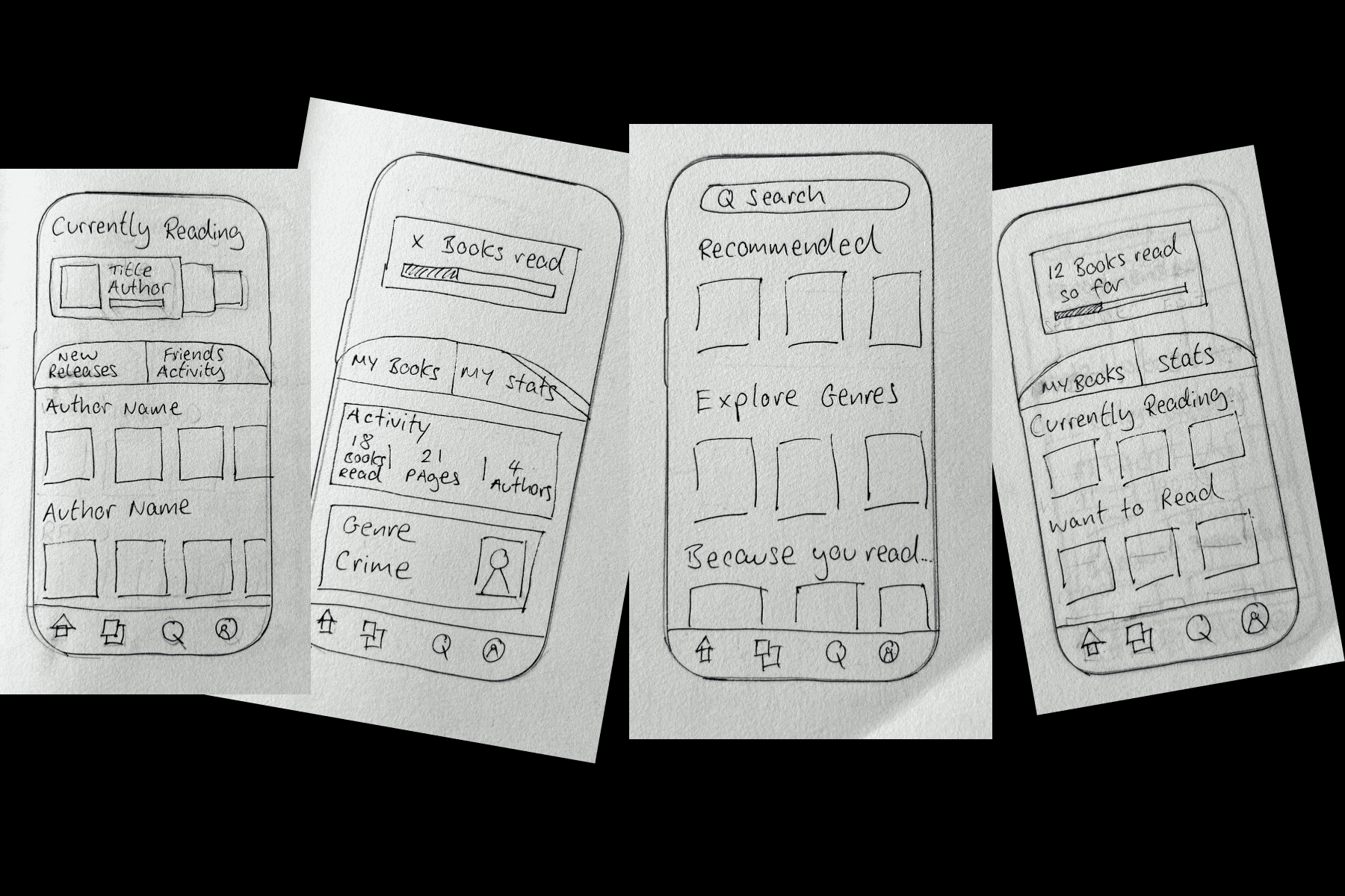
Ideation phase
The Homepage
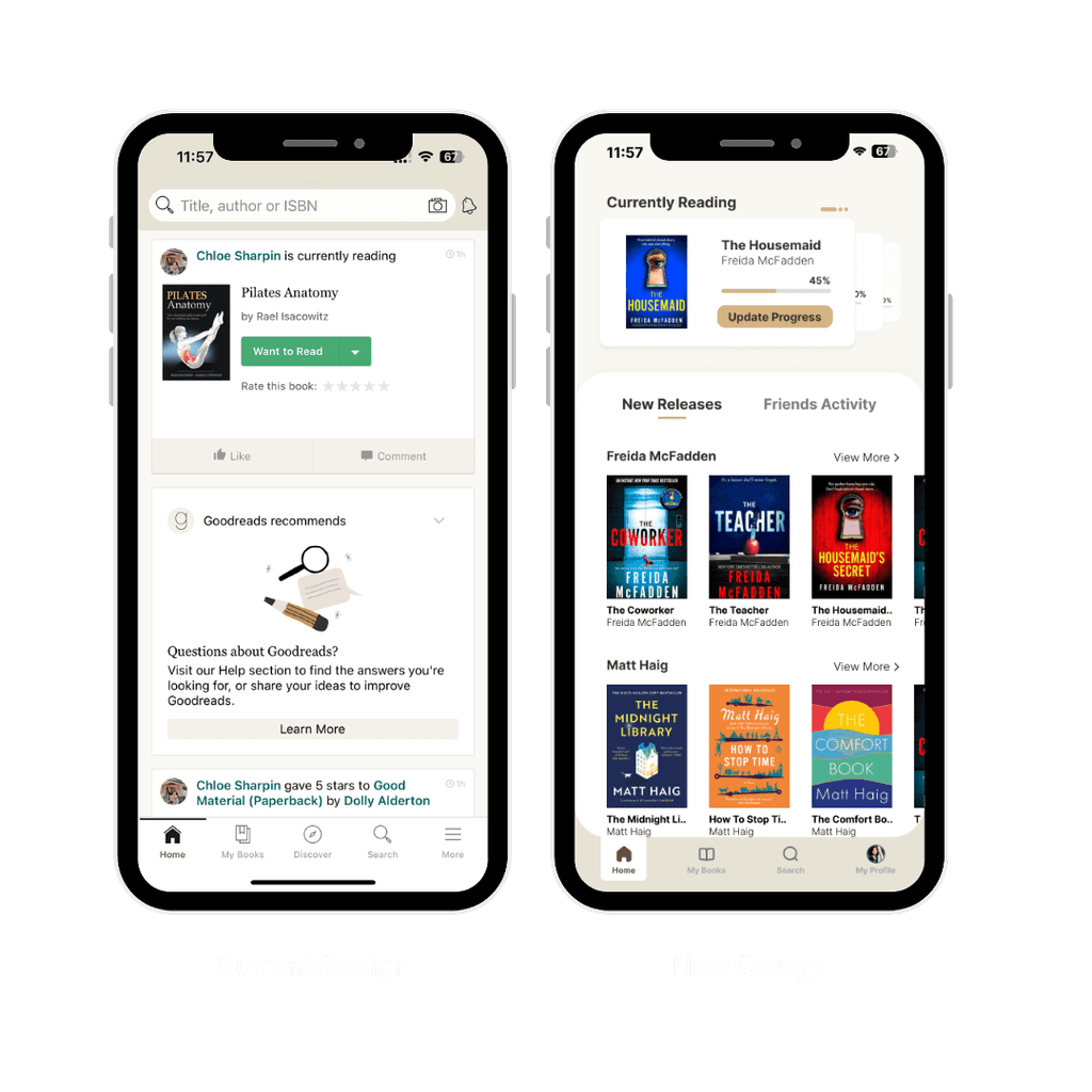
Before: Users faced a cluttered homepage that did not prioritize key actions.
After: The redesigned homepage features 'currently reading' books at the top, allowing users to update their progress with ease. This change reduces user frustration by simplifying the navigation process.
I also allowed for the user to mark ‘half stars’ once they have finished a book. Below this, I split out the ‘new releases’ and ‘friends activity’ to organise the information on the first screen and make it easier for the user to navigate upon opening the app.
View the user flow:
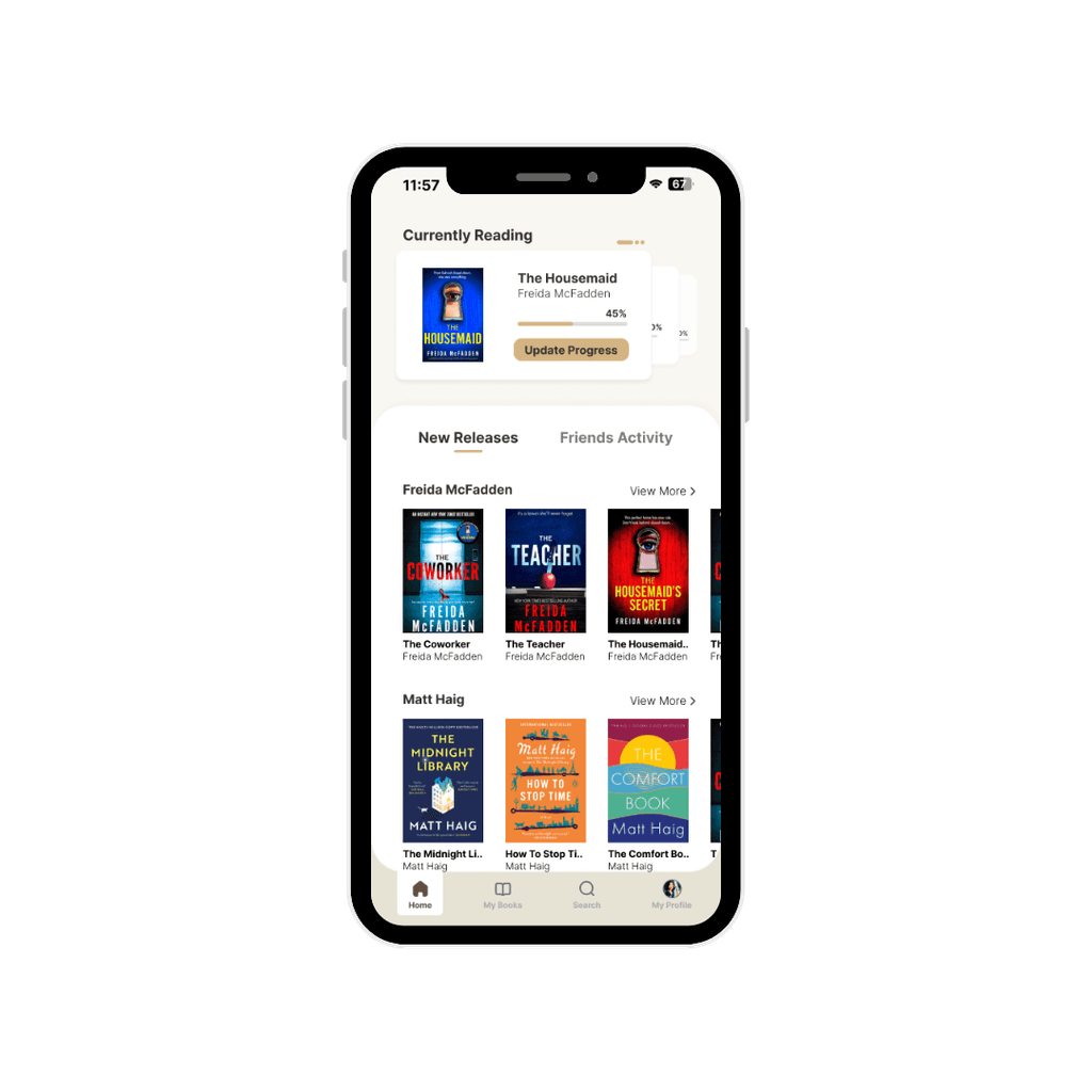
The Homepage
Press the 'Update Progress' button
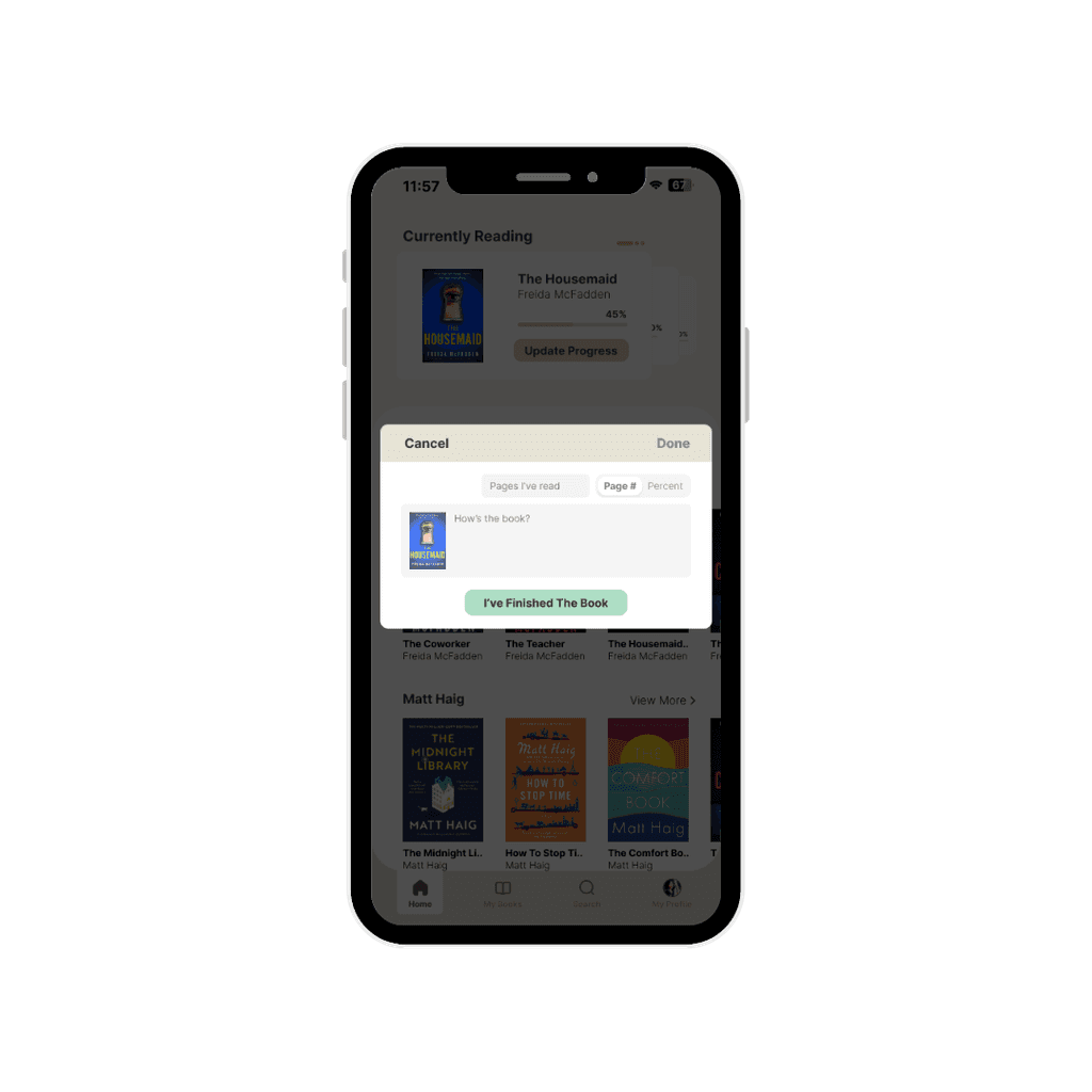
Rating the book
Mark how much you have now read of the book
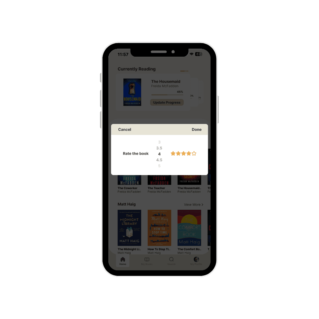
Star rating
If finished, the app now allows you to give half star ratings
My Books
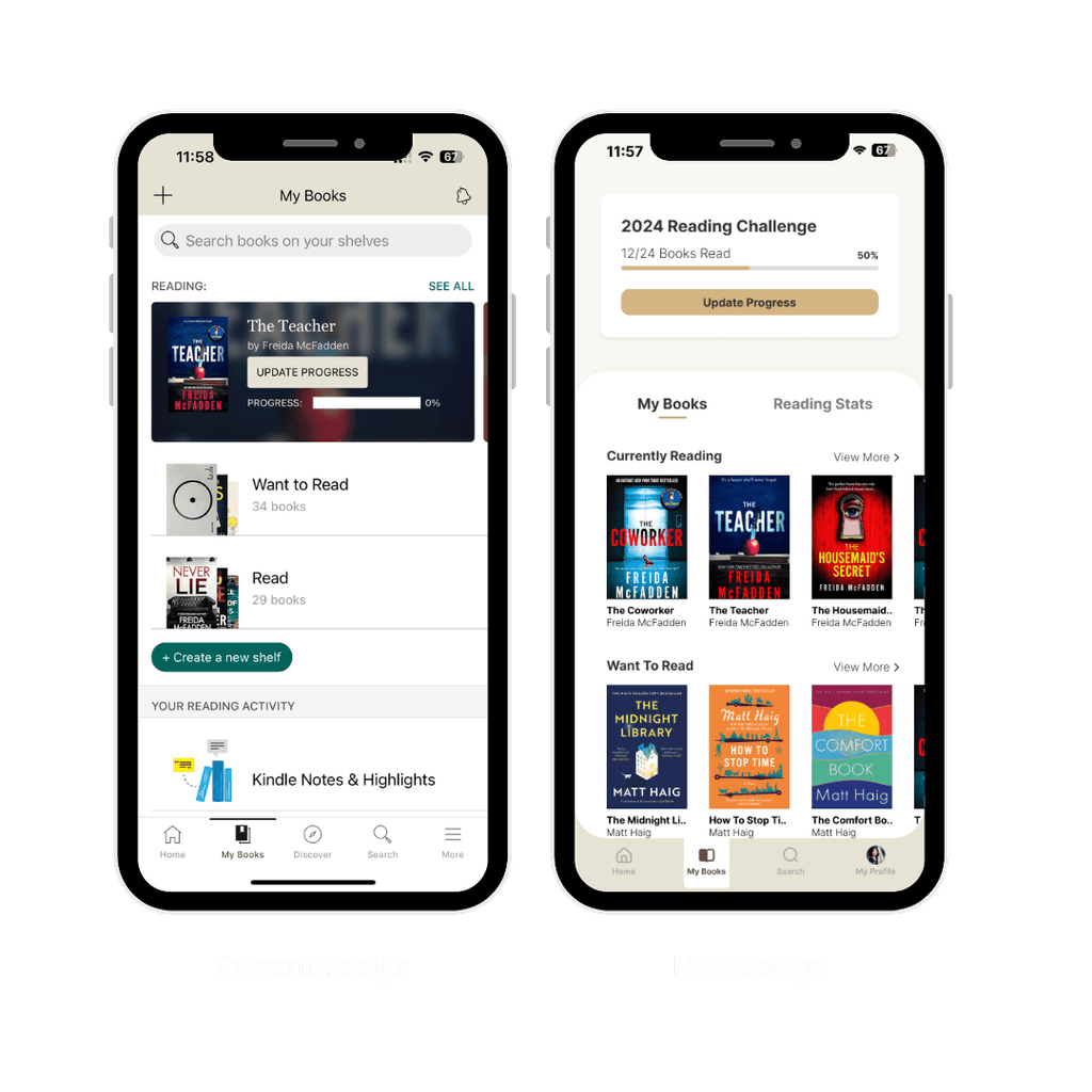
Before: Users struggled to find and review their reading stats.
After: The new 'My Books' section is split into 'My Books' and 'Reading Stats,' making it easier for users to quickly access and share their reading statistics.
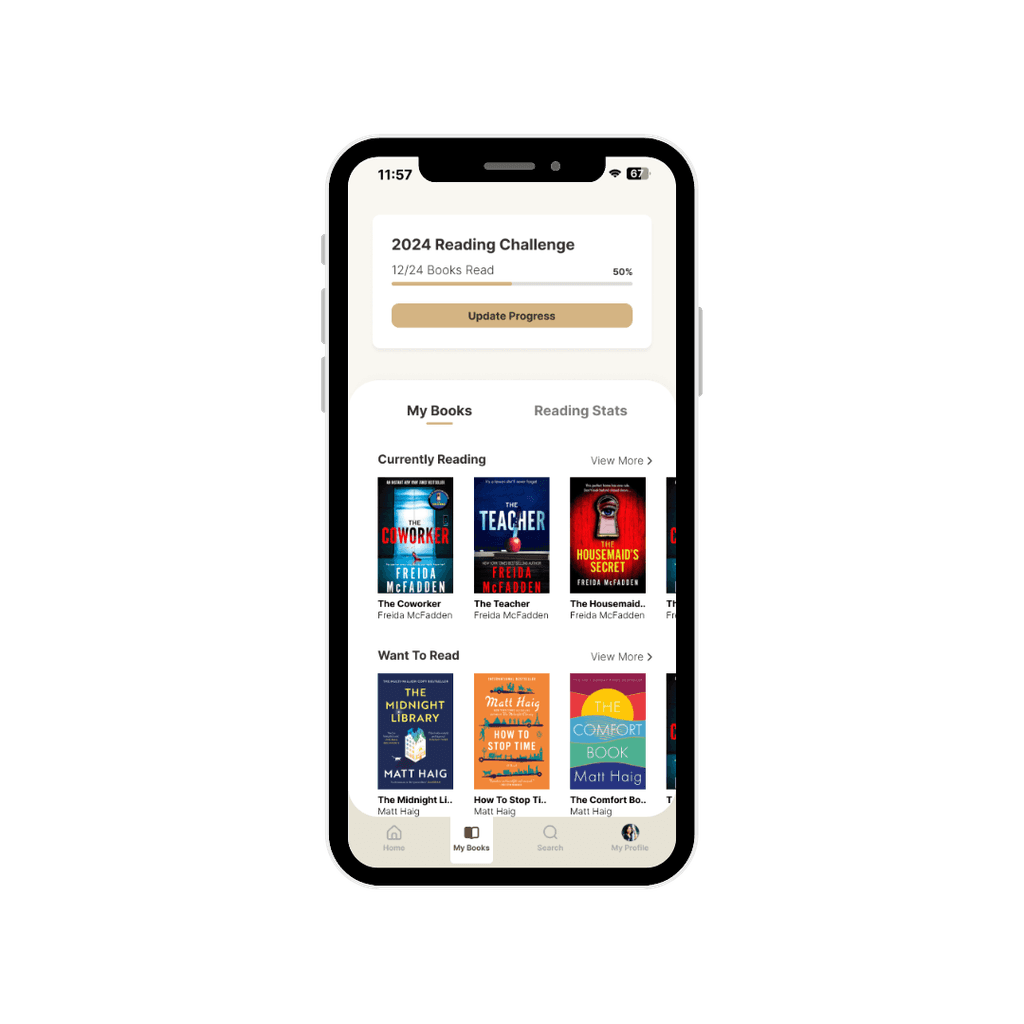
My Books Tab
Access what your reading lists quickly
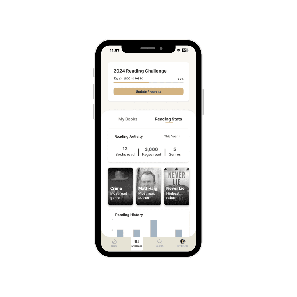
Reading Stats
Also access your stats on the same tab
RESULTS
Evaluating Goodreads current usability
The redesign of the Goodreads app resulted in significant improvements in both usability and user satisfaction. Based on user reviews of the protoypes:
Improved Navigation: User feedback indicated an increase in satisfaction with the navigation.
Modernized Design: Users reported a more enjoyable experience due to the updated design.
Enhanced Stats Access: The new 'Reading Stats' feature received positive reviews for its ease of use and clarity.
TAKEAWAYS
Add takeaway message
User-Centric Design is Key: This project underscored the importance of focusing on user needs and frustrations. Simplifying navigation and updating the design significantly improved user satisfaction.
Design Consistency Matters: Maintaining a cohesive and modern design language across the app helped in aligning user expectations and improving overall usability.

